
SEATTLE PUBLIC LIBRARY REBRAND
The Seattle Public Library is a community-based institution that provides free, traditional and advance guard resources, to residents of the city. A new brand strategy needs to be imaginative, flexible and capable to evolve with Seattle’s present growth while staying true to the values that have shaped this city’s rich history and culture.
BRAND CHARACTER:
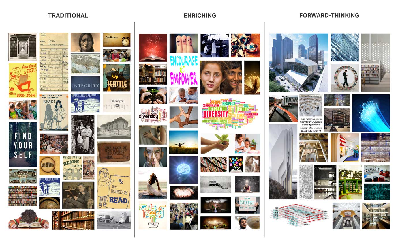
TRADITIONAL
ENRICHING
FORWARD-THINKING
BRAND ATTRIBUTES:
HERITAGE
NO COST
LIBRARIANS
BRAND PURPOSE:
The Seattle Public Library connects the community to free essential resources to enrich their lives.
BRAND TAGLINE:
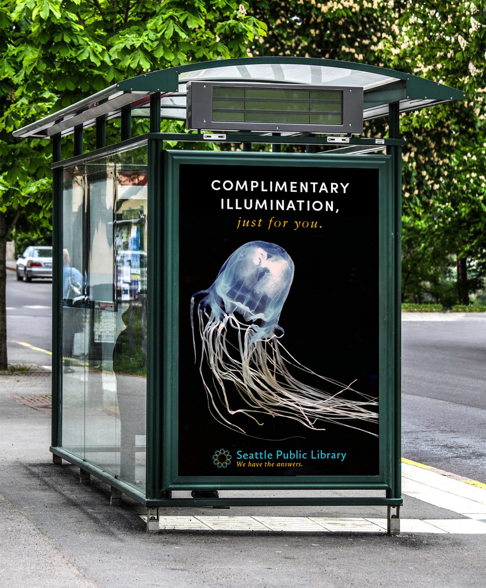
We have the answers.
PRIMARY LOGO


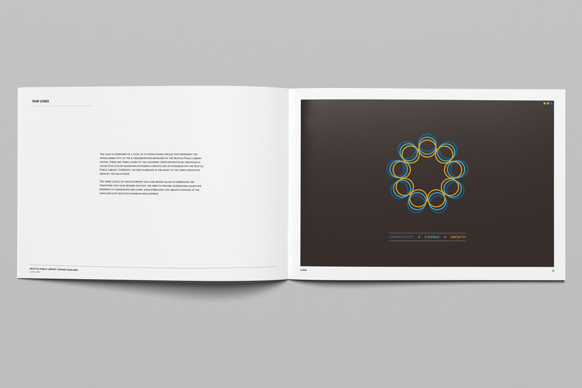
The logo is composed of a total of 27 interlocking circles that represent the interconnectvity of the 27 neighborhood branches of the Seattle Public Library system. There are three layers to the logomark, made distinctive by variations in color. Each color gradation epitomizes a specific era of expansion for the Seattle Public Library. Currently, we find ourselves in the heart of the third stratum of growth, the gold phase.


The three levels of circles embody our core brand values of embracing the traditions that have defined our past, the need to provide an enriching haven for denziens to congergate and learn, while embracing the library's position at the vanguard with seattle's expansive development.
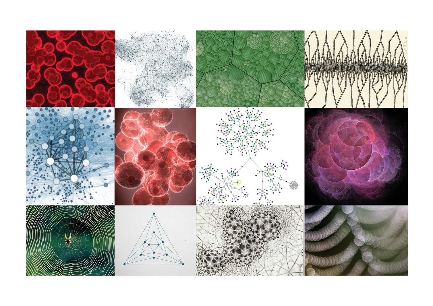
The new logo gently takes cues from science. In particular the exponential growth found in the doubling of cellular division and the molecular analysis of thermal expansion that becomes a metaphor for how a library can maintain connectivity, flexibility and growth within a burgeoning metropolis.


Inspired by the tenants of discovery, imagination and integrity, SPL's refreshed color palette is derived from a series of moodboards that carefully reflect upon the library's continued essential role as a stable pillar for a constantly evolving city.
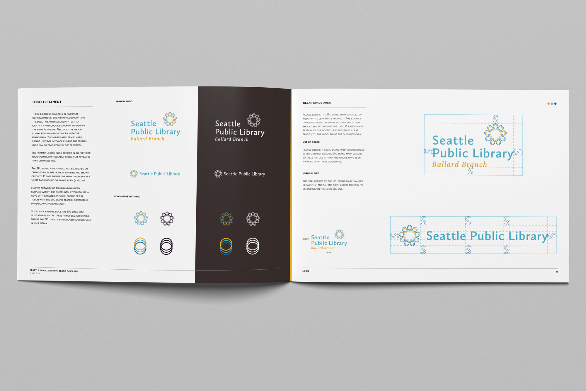
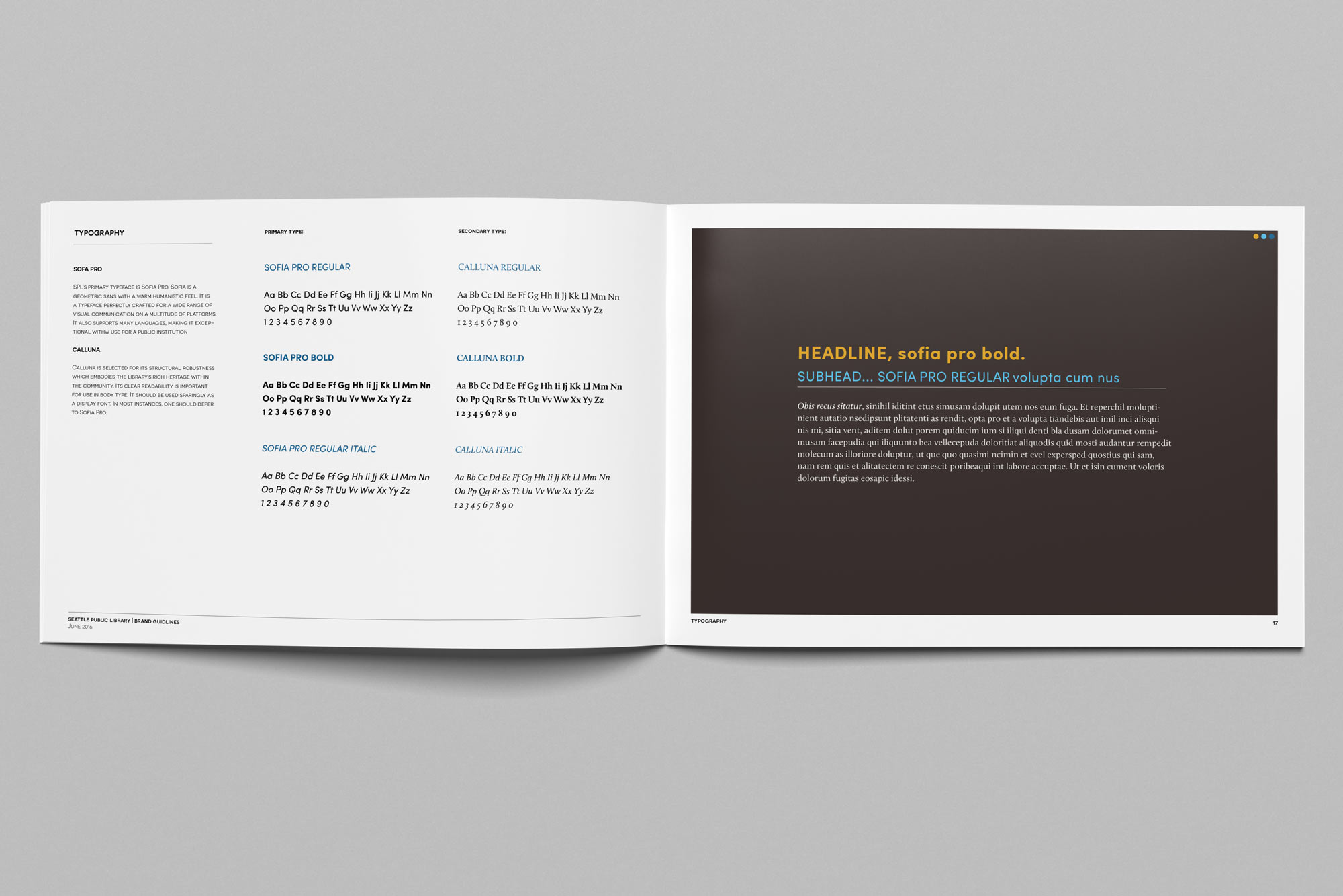
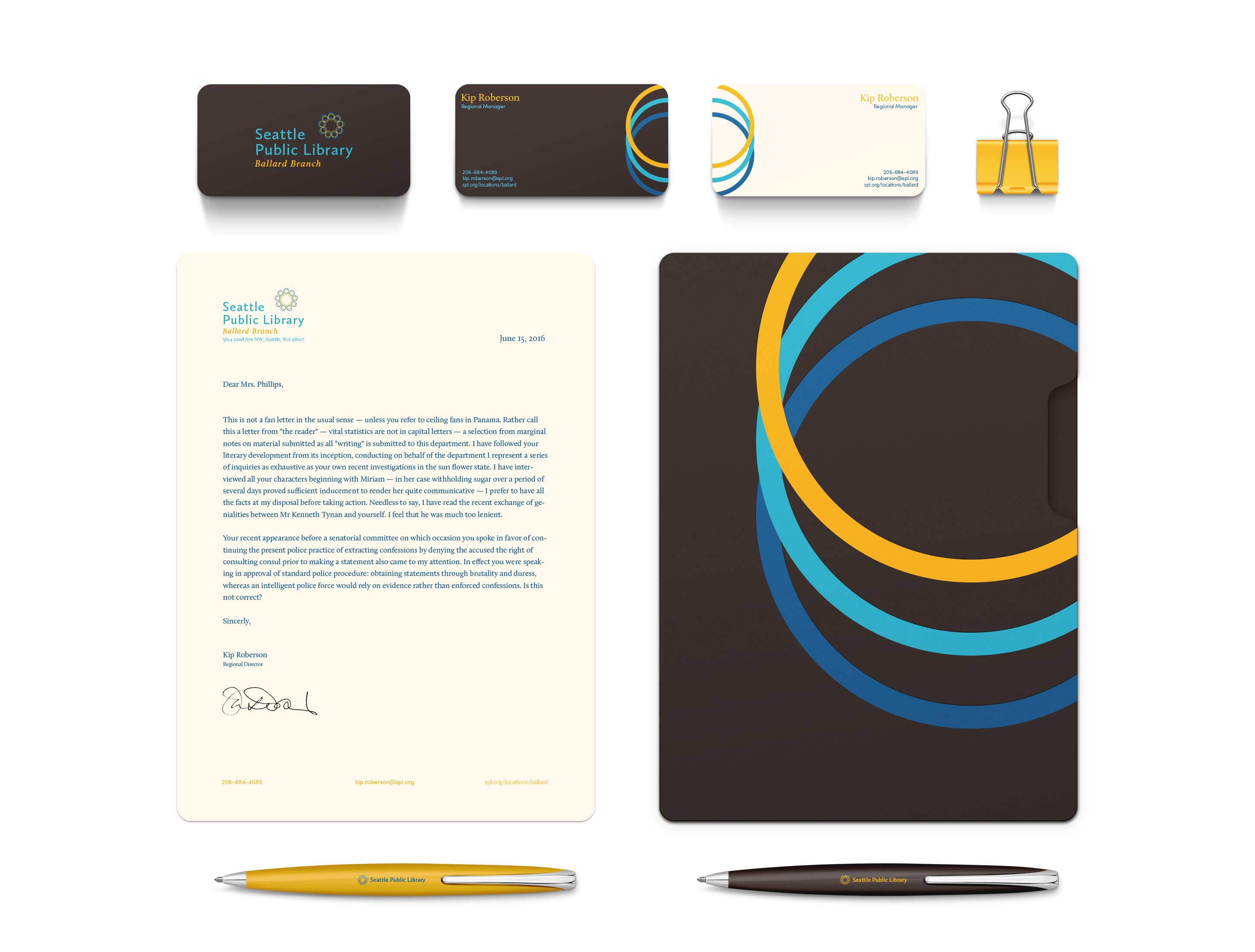
BRAND GUIDELINES (exerpt)


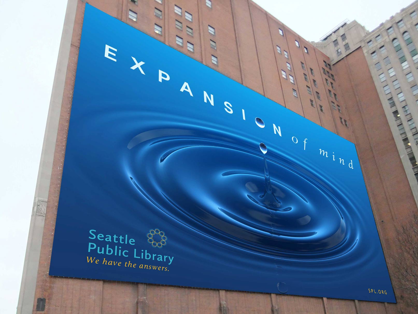
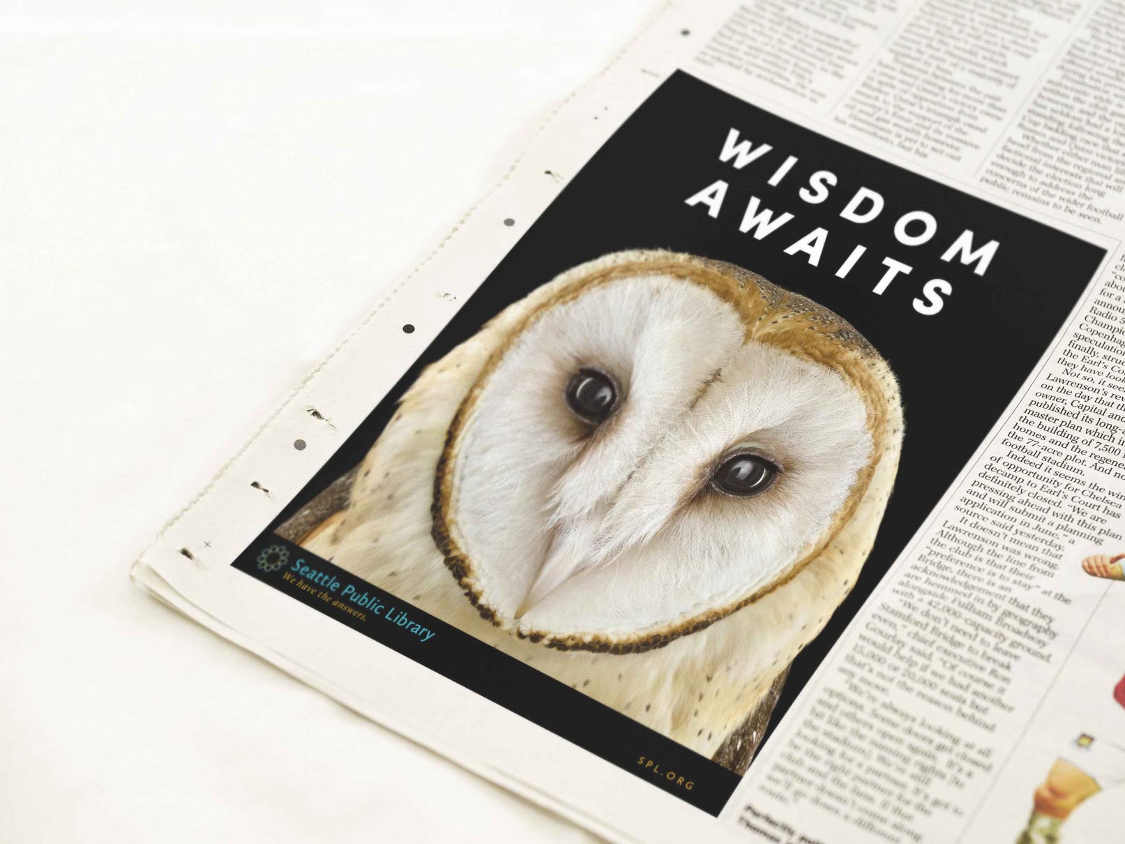
ADVERTISING CAMPAIGN


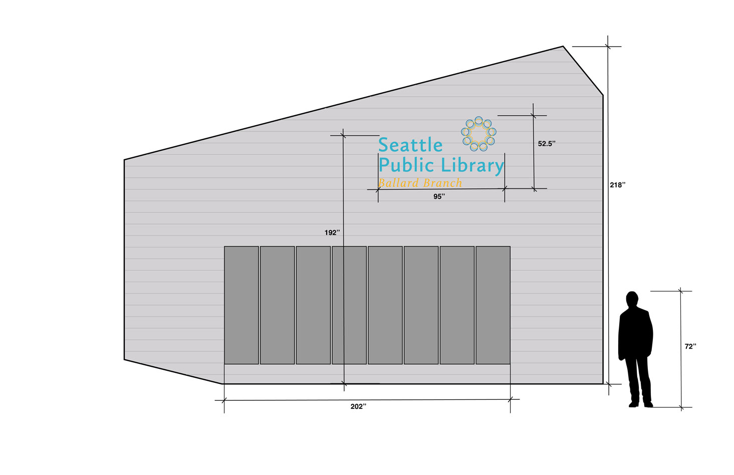
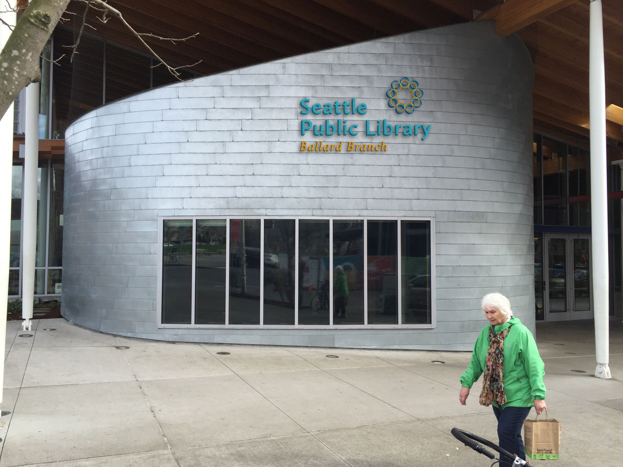
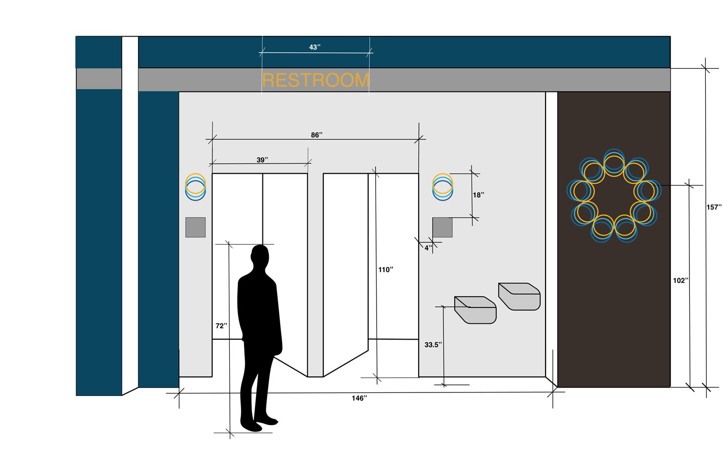
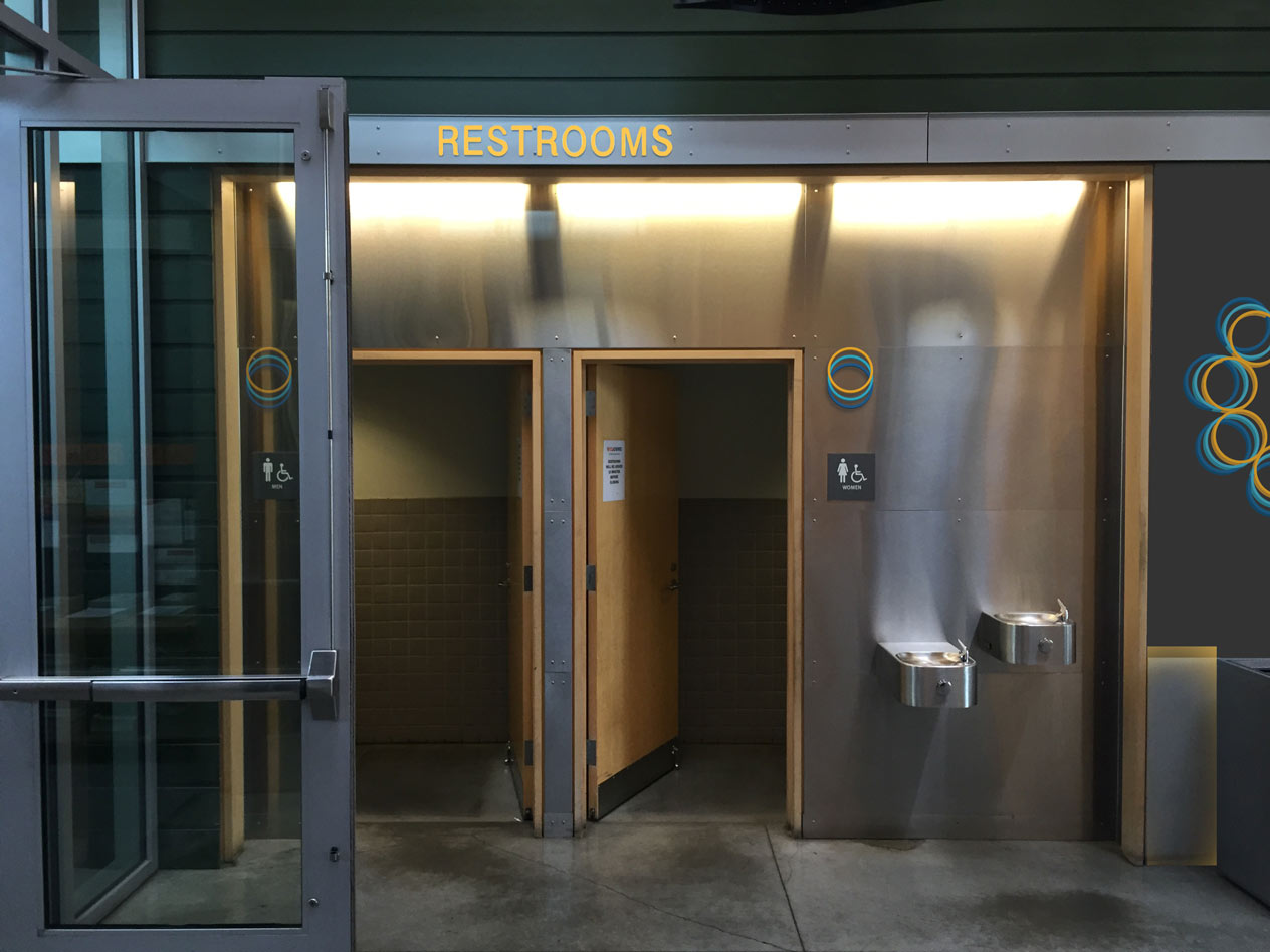
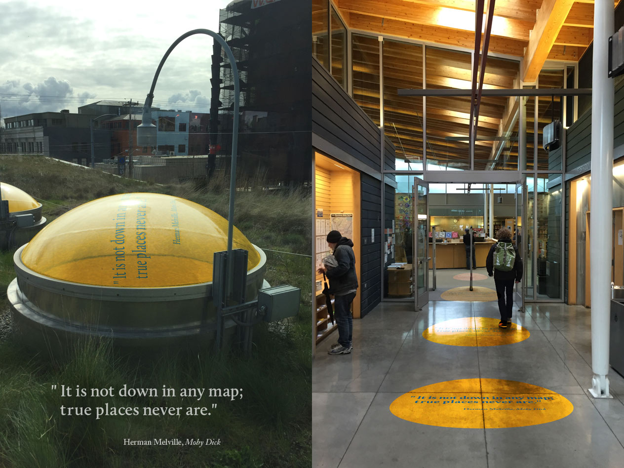
BALLARD BRANCH ENVIRONMETAL DESIGN
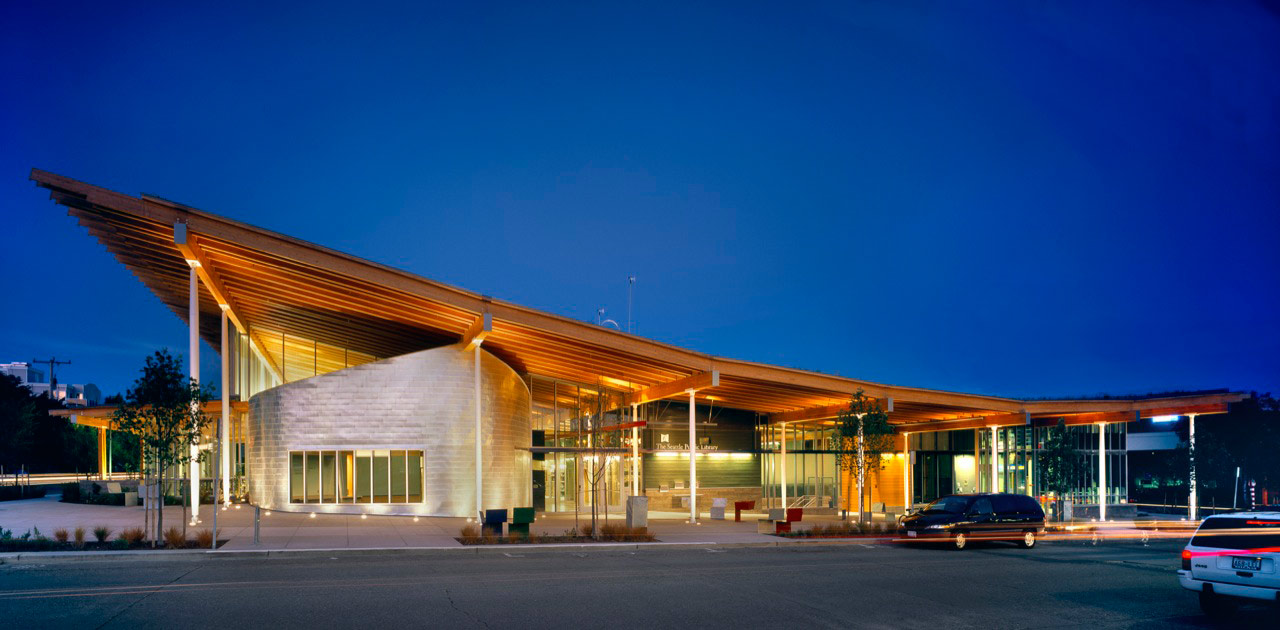

Ballard is a willfully eccentric section of Seattle that prides itself on its Scandinavian heritage and seafaring tradition. Although the community is rapidly modernizing and gentrifying, newcomers and old-timers alike are determined to keep that identity alive.
Updated large signage, innovative wayfinding, and clear wayfinding was essential for giving patrons the best experience possible while helping to highlight the library's unique identity.


